
Housing: Goodbye Drought, Hello Glut

· The “housing shortage” is yesterday’s problem.
· Today we are on the cusp of a housing glut.
· All analyses hinge on how best to measure household growth
Back in spring 2020, when Covid hit, Americans faced a serious housing shortage. This shortage, combined with Covid-driven demand and artificially suppressed mortgage interest rates, sparked a breathtaking jump in home prices and rental costs. In two short years, the average existing house price levitated 40% -- much more than the rate of inflation -- and has continued to rise. Today, the market is stuck; few existing homes are selling and homes are unaffordable for most Americans.
Thanks for reading Charles’s Newsletter! Subscribe for free to receive new posts and support my work.
Subscribed

Case-Shiller Index of Home Prices
In my opinion, this housing shortage is already in our rear-view mirror. Today, we face a housing glut; our housing market looks nearly as overbuilt today as it was in 2006, just prior to the 2008 financial crisis. This suggests that home construction will collapse, and home prices will plummet.
Or not.
If that sounds like ambivalence, it is. As is so often the case, our housing predicament turns out to be more complicated than I initially expected.
My analysis centers on the following chart:
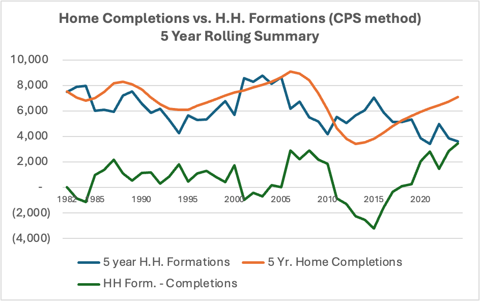
This chart depicts historical 5-year cumulative new home completions (a proxy for housing supply) measured against 5-year cumulative household formations (a proxy for housing demand). When the green line is less than zero, it indicates a period of under building and housing shortage. When the green line is positive, it suggests a period of overbuilding and possible excess. Thus, in five years we have flipped from a deficit of 3 million homes to a surplus of nearly 4 million homes.
Armed with this approach I figured that I could be highly confident in any conclusion I might draw as long as the government statistics were accurate. That is, if household formations in recent years exceeded housing starts, then I would have strong evidence of a housing shortage. The reverse would indicate a surplus.
But I soon discovered that I was entering a bizarro statistical world in which nothing was as it seemed. Now, the only thing I know for sure is that readers should be highly skeptical of anyone who professes certainty about the state of our housing market.
News Flash! Along with the January payroll survey, the Bureau of Labor Statistics revised higher its estimate of US population by 2.9 million individuals. As you (hopefully) continue reading this article, you will see that this is not a big surprise. Of these new residents, 2.1 million were either Asian or Hispanic, suggesting that the adjustment might be related to a prior underestimate of immigration. The revision suggests that households also have been undercounted by 1.5 million give or take. I have not changed the content of my article in response to these revisions for two reasons. First, many details are not yet available, and second, because the revision does not change my conclusion. It enhances my confidence in predicting a housing excess, but reduces my concerns about an outright housing collapse. Just keep these revisions in mind.
Estimating Demand for Housing is Tricky
I had always thought that household formations was a pretty straightforward measure of the annual increase in households resulting from marriages and kids graduating from college and things like that. But it turns out that there are serious complications with how we measure household formations. (Actually, a marriage will reduce the number of households if the two spouses previously had been living independently.)
One obvious problem with household formations is that they are at least partially determined by feedback from the housing market itself. If more housing becomes available at a lower price, more young folks than we currently expect will be inclined to leave mom’s basement and strike out on their own. Thus, household formation only measures the demand for homes at the market-clearing price. I’m certain that a 25% drop in the price of New York City condos would bring a lot of new households (i.e. ex-roommates) out of the woodwork.
A far more serious problem is that the government uses at least three methods to calculate “households”. The two most important are the “Current Population Survey” (CPS) which I have used in the chart above, and the “Home Vacancy Survey” (HVS). A third is the American Community Survey (ACS). Once a decade, all of these can be “trued up” based on results from the national census.
The CPS takes our total population and assigns a “headship rate” weighting to each person. Demographics play a critical role as younger folks roll in and older folks well, uh, roll out. Right now, the “over 65 cohort” is still growing far more rapidly than any other. The CPS has two big drawbacks; it is released only once a year and the headship rate hinges on somewhat subjective assumptions about the population, not on raw data or surveys.
The HVS is the product of monthly surveys of property owners to determine how much of our total housing stock is vacant. The difference between total stock and vacancies is total households. The ACS has recently tracked closely with the HVS
The CPS and the HVS have been spitting out vastly different results for decades now. The CPS counted 3.8 million household formations in the 4 years from 1/1/2020 to 1/1/2024. The HVS counted 7.1 million household formations in those 4 years – 3.3 million more than the CPS. This difference seems likely to have increased in 2024.
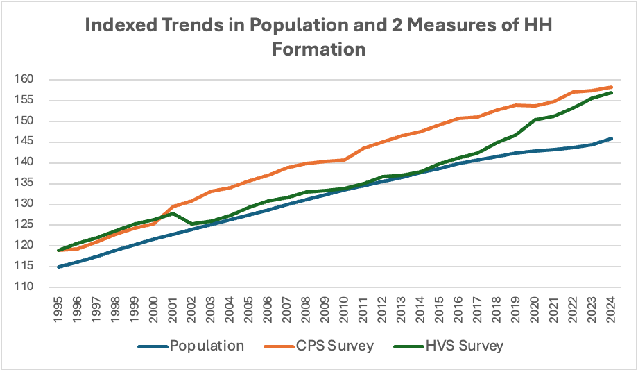
This chart depicts the thirty-year trend for the two methods, compared to total US population growth (the lines are indexed to 1985). You can see that the HVS, after a large downward adjustment following the 2000 census, has been growing far faster than either of the other two:
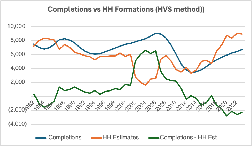
The chart below shows what my original chart looks like using HVS rather than CPS. As you would expect, this picture tells an entirely different story from the first one. In fact, you might say that this result is the “opposite” of the original; a 3 million home surplus morphs into a 2 million-ish deficit:
Not to put too fine a point on it, but both measures cannot be right. At least one must be wrong. More likely, they are both wrong and reality lies somewhere between the two.
Most experts who allege a serious housing shortage rely on the HVS. They typically estimate the putative shortfall with some version of the following methodology: they take the current home vacancy rate obtained in the HVS survey of property owners and compare it to the historical average vacancy rate. (See these two excellent articles from David Wessel at Brookings and Elena Patel at Brookings.) An above average vacancy rate points to a housing surplus, while a below average rate indicates a deficit. They then take the difference between the current rate and the average rate and multiply it by the total housing stock. This provides an estimate of how many units short we might be.
The upshot is that if the “Housing Vacancy Survey” estimate is off, then one must question the validity of any analysis that is based on it. And I think there is good reason to believe it is inaccurate. It may not be a coincidence that the 3.3 million household difference between the two surveys roughly mirrors what many analyses conclude is our housing deficit.
Frankly, I find it mystifying that there has not been more of an effort among housing economists to reconcile these two measures. This is not a new problem. As I explored this issue, I found just one paper on the subject, but it is excellent. The paper was written in 2015 by Daniel McCue at The Harvard Joint Center for Housing Studies. He discusses the details of each measure and tries to identify its weaknesses. As far as I can tell, there have not been substantive changes to either measure since this piece was written.
Unfortunately, we must choose just one method for our analysis, while keeping in the back of our minds that the alternative method yields very different results. I thought about averaging the CPS and the HVS, but I didn’t see how that would get us any closer to the truth. If I did so, there would still be a moderate housing surplus.
I have chosen to use the CPS for several reasons. First, the 3.8 million increase in households from 1/1/2020 to 1/1/2024 seems more consistent with the 10.1 million increase in total US population than does the HVS increase of 7.1 million. For the HVS to be accurate would have required an unprecedented jump in the householder rate to 70%.
A second reason for selecting the CPS is that it seems more consistent with the historical trend in household formations. In this recent report, again by Daniel McCue, we can see that average annual household formations have been steadily declining for the last three decades – from 1.35 million in the 1990’s to 1.12 million in the 2000’s to 1.01 million in the 2010’s. The CPS shows an average increase from 1/1/2020 to 1/1/2024 of .85 million while the HVS shows 1.75 million. This would imply a sharp reversal of trend.

HVS Household Estimates
A final reason to choose CPS is that the volatility of HVS makes me suspicious. The Covid years are a case in point. As you can see from the chart, HVS shows households increasing 3 million in early 2020 and then dropping back down by year end. Strangely, this spike occurred entirely in April through June 2020, which seem too early in the epidemic for such a dramatic reaction. In the entire history of the HVS since 1960, there have been only two moves of this magnitude – one up, one down. I think it is probable that this behavior results from either re-benchmarking after the 2020 census or survey challenges during Covid.
As has been evident in recent electoral surveys, response rates to all surveys have been declining over the years and were particularly problematic during the Covid crisis. This may have been a particular issue for HVS since it was based on surveys of vacancy rates at a time when many US citizens were changing residences – university students, for instance.
Still, I don’t think that the HVS can be dismissed out of hand. Lots of weird stuff happened during the Covid years. I don’t doubt that the CPS may have undercounted households. Urban myth or not, the 2010’s are remembered as a decade in which young folks remained hunkered down at home, and it is certainly possible that Covid cash enabled these kids to move out. Also, as alluded to above, millions of students were driven from their dormitories. Some returned home, but many others may have rented an apartment or bought a home. Plus, work-from-home norms changed significantly. Lastly, immigration may play a role, though I cannot see why immigration would boost household formation without having much of an impact on the total population.
Estimating Housing Supply is even Trickier.
If “household formations” is an imperfect tool for measuring housing demand, estimating housing supply is even worse. Simply put, we have no idea what the supply of existing homes might be. I use new home completions as a proxy for supply because it is at least a reliable number and provides an accurate measure of the incremental addition to supply.
I think that the most commonly used measures of supply are suspect. As mentioned above, many analysts focus on “home vacancies.” But this measure assumes that any home to be sold over the next year or so now stands empty. Clearly, this does not include the many homes that are now occupied whose owners might be considering a sale.

Source: NAR
Similarly, current listings (also known as “month’s supply”) are clearly not an accurate measure of underlying supply. As the chart above demonstrates, low month’s supply in 2005 certainly did not reflect an under built housing market. However, I do think that this chart does illustrate something absolutely crucial; builders of new homes will be increasingly motivated to reduce inventory by cutting price. Eventually, home owners will join them.
Both “vacancies” and “months supply” omit the things we really want to know; how many homeowners are waiting on the sidelines to list their homes, at what price they would sell, and what might motivate them to get off their duffs. My working assumption is that there is an immense number of willing sellers at what appears to be the current (but Illusory) market price.
If there are plenty of sellers, why the logjam?
So now we arrive at the critical question; if we’ve built too many homes in an economy that to all appearances remains quite strong, what explains our current housing logjam? Why are sales of existing homes so sporadic and why do prices remain out of reach for the average citizen? In other words, why does the market ACT LIKE we still have a housing shortage?
The answer is that the market cannot clear. As mentioned above, a canyon has gapped open between the price that sellers think their house is worth (often the last comparable transaction) and the price that hopeful buyers are willing to pay or can afford to pay. Existing home sales linger near the nadir established in 2011 following the financial crisis. Simply put, I suspect that many experts are observing lofty home prices and low transaction volume and calling that a shortage when in fact it is really something quite different.
Partly, this is because current homeowners feel no urgency to sell, which in many cases would necessitate reducing the asking price that is stuck in one’s imagination. Dan Kahneman called this “anchoring”; no one wants to sell her house at a lower price than her neighbor sold hers for last year.
But far more important is the well-known fact that most homeowners are “locked into” mortgages with interest rates in the 2.5% to 4.0% range. As the prevailing mortgage rate has risen to 7.0%, homeowners cannot afford to sell their homes; to do so would necessitate buying a new home and replacing the legacy mortgage with a new one at a much higher interest rate or renting an apartment at a time when rents too are no bargain. Either way, one’s monthly payment could increase sharply even if one buys a cheaper home. Thus, there is little financial incentive for an owner to sell her house at or near the current effective bid price.
A highly unique -if not once in a lifetime - set of circumstances coalesced early in the Covid epidemic to propel home prices into the stratosphere: a house shortage, desperate buyers, and artificially suppressed mortgage interest rates. These forces sent home prices far higher than can be justified in today’s world with 7% mortgage interest rates. In a market as illiquid as real estate, it could take a long time for prices to adjust lower.
Further evidence for the “market freeze” argument is that existing homes were trading extremely actively immediately after Covid set in – near the record volume of 7 million set in 2005. But when mortgage rates started rising in 2022 sales evaporated, declining to the 4.3 million annual rate we see today. Believers in a housing shortage today must explain why transactions today are so much rarer than in 2020 even though we have 7 million more housing units.
In my view, it is inevitable that home prices will revert toward the long-term trend (adjusting for inflation.) But the speed and extent of this decline will depend on broader economic trends, especially interest rates. If a recession should emerge, the decline could be quite violent. Best case (for homeowners) is that the economy keeps chugging along, and their homes don’t appreciate much over the next 5 years. Then, on a present value basis, their homes will sell for ~20% less than what they expect today.
A word of caution; It is the nature of illiquid markets to appear stable when there is little business transacting. It only takes a few motivated sellers “hitting the bid” to upset the entire apple cart; prices are set at the margin. In Wall Street parlance, I suspect that a large number of today’s homes are in “weak hands”.

Median Price of NEW Homes
Interestingly, as the chart above illustrates, median new home prices already have started to slide, dropping 15% since the peak in October 2022. (This was recently pointed out by Moses Sternstein in his excellent Substack “Random Walk”. He has done a terrific job of tracking the putative “housing shortage” problem. He too believes that any shortage is exaggerated.) This decline likely reflects builder incentives like mortgage buydowns. Unlike homeowners, builders are under constant pressure to sell inventory and move on to the next deal. With inventories growing, builders are ever more motivated to sell. This could eventually drive “weak handed” homeowners to capitulate.

New privately owned housing units under construction
Above is a chart that supports my argument for a looming housing surplus. In July 2022, there were 20% more homes under construction than there were at the pre- financial crisis peak in 2005. Currently, we are still above that peak.
Immigration and Unintended Consequences
Throughout my report, I assume that all metrics that are proxies for demand – population, estimates, and totals – incorporate immigration accurately, or at least consistently. If not, this could account for much of the difference between the various measures. If it ultimately turns out that the HVS proves the more accurate measure of household formation, it will probably have been because the CPS mismeasured immigration.
Regarding immigration, I must point out that Donald Trump’s announced policies could cripple the residential construction industry. Even one or two million net deportations could severely curtail net house absorption. Five million or more would be a calamity that essentially would constitute an immense transfer of wealth from homeowners to ICE employees and assorted vigilante groups. At the same time, contractors will lose some of their least expensive and hardest working employees. Of course, it will also release a lot of affordable housing for the trickle of buyers who remain.
Don’t Bogart that House, My Friend
Demographics will influence how the housing market sorts out.
Roughly 80% of citizens over 65, and a shocking 80% over those over 75, live in their own home (including co-habitants). With 60 million individuals over 65, this suggests that about 30 million units or 25% of the total housing stock is owned by seniors. These numbers are not out of line with the recent past and, since the number of seniors is expected to increase to 80 million in 2050, these units are unlikely to be a huge near-term source of supply.
However, for most homeowners – including seniors – a house is by far their biggest asset. Consciously or not, many are relying on this asset to fund their retirements. Thus, home equity may be incorrectly regarded as “savings” which are near all-time lows nationwide. While the most probable scenario is that home prices diminish slowly over time, an economic shock could spark real panic as seniors (and others) try to dump their homes en masse to protect their “savings.”
Regional Trends, Commercial Construction, and Multifamily
Whatever lies ahead for housing, there will be vastly different consequences for different regions of the country. Roughly 2/3 of home starts in recent years have been in the West and South regions of the country. This should not be surprising; these are the regions that are gaining population. Plus, they (excluding the west coast) have the least oppressive building regulations and have enough open space for national builders to roll out large communities. Moreover, it may well be the case that insufficient building took place in the Northeast, where a regional shortage may still exist.

Construction Employment
This construction activity may prove to be a mixed blessing for the South and West. If we have seen the peak in new home construction, then a lot of jobs could be lost. In the financial crisis construction employment did not peak until nearly a year after housing completions.
So far in this article, I have pretty much ignored the commercial building industry. To the extent possible, I have tried to keep my data strictly residential. But in some cases this is not possible, as in the employment chart above.

Residential Construction Spending

Non-Residential Construction Spending
Historically, non-residential construction trends have tracked residential trends pretty closely but tend to be much less volatile. Since 2019, however, commercial construction growth has been off the charts, even after taking inflation into account. In the two years from September 2021 to September 2023, non-residential construction soared 50%, from an annual rate of $839 billion to an annual rate of $1.238 trillion, helping to offset the residential slowdown. I surmise that most of this increase stemmed from government projects authorized under various Biden programs and investments in manufacturing facilities like data centers. Within the latter category there must be an immense upwelling in AI – related projects. I suspect that there is an AI bubble inflating, but it doesn’t seem big enough to threaten the economy if it pops.
Multifamily construction constitutes a larger share of housing completions than in the past and a disproportionate share of recent completions. This could put pressure on rents and ultimately feed into home prices.

New units completed in buildings with 5 units or more
Conclusion: Buyer’s market ahead.
If I can hammer home just one point, it is this: any housing shortage or surplus we may have cannot be considered independent of price. If twenty million Americans want to own a home but cannot afford one, this does not necessarily constitute a housing shortage. At least, it is not one that the private sector can resolve. The homeless problem in cities like New York and Los Angeles stems importantly from the impossibility of building homes at affordable prices due to labor costs (unions), land costs, insurance costs, material costs (tariffs on Canadian lumber won’t help), and, especially, regulatory costs and restrictions. The NAHB estimates that the average cost of regulation factored into each new home is $93,000 – nearly a quarter of the price of a new home. In cities like New York, costs are further distorted by a welter of additional factors like rent stabilization, which keep all rents and house prices artificially high.
So finally, what can we reasonably conclude about the state of the U.S. housing market? At least we can be sure of two things: all measures of housing demand are deeply flawed, and all measures of housing supply are deeply flawed.
Recognizing this, we must select the least flawed path, and that is what I have striven to do. I think that any analysis based on the Home Vacancy Survey probably presents an inaccurate picture of our housing market. It is highly likely that there is no housing shortage at all. The CPS is by no means perfect but seems preferable.
Crucially, IF the Current Population Survey is close to accurate, we face at least a moderate housing surplus with gradually declining home prices in future years and we could be facing a glut. Could this slowdown turn into a real collapse? Yes, but I think it would require a much weaker economy or much higher interest rates than the consensus now expects.